
The Evolution of Cabinet Color in 2026

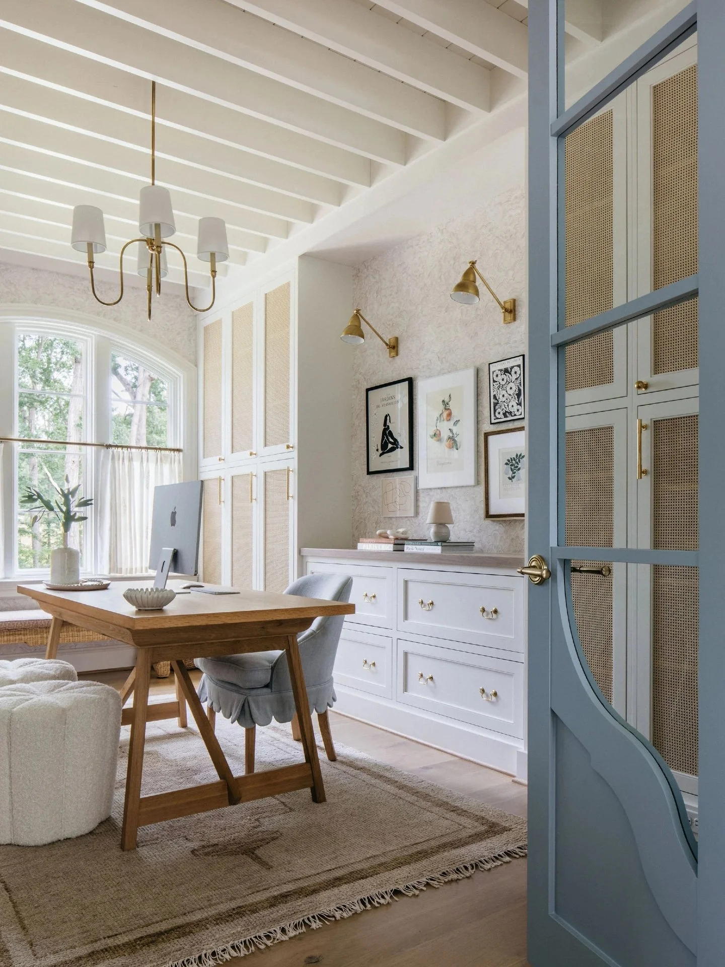
A balanced blend of white uppers and wood base cabinets for a timeless, transitional look.
When homeowners picture their dream kitchen or bath, color is often the first thing they see in their minds. The right shade can make a room feel expansive, peaceful, or instantly timeless. Yet choosing cabinetry color is about more than beauty. It is about longevity, function, and emotion.
The cabinetry palette of 2025 and 2026 reflects a universal desire for warmth, grounding, and authenticity.
These colors are personal; they tell the story of how people want to live, not just how they want their homes to look.
(Pressed for time? Scroll to the bottom for a quick TL;DR.)
Why Color Matters More Than Ever
Cabinetry anchors a space. It sets the tone for every light fixture, hardware choice, and wall color around it. According to the National Kitchen & Bath Association, 74 percent of homeowners say cabinetry color is the single most influential element in their design decisions.
When you walk into a kitchen, your eyes land first on cabinetry because it covers roughly 40 percent of the visible surface area. That means the tone you choose, whether a soft cream, deep walnut, or moody green, defines how the entire space feels.
For designers and builders, understanding color psychology helps guide clients toward finishes that photograph beautifully and age gracefully.

Classic 1980s cherry cabinetry that inspired today’s shift toward softer, lighter, and more natural tones.
The Cycles of Cabinet Color
Color trends always mirror the mood of the moment.
In the 1980s, dark cherry and walnut symbolized craftsmanship and prosperity.
The 1990s brought golden oak and honey tones that felt warm and traditional.
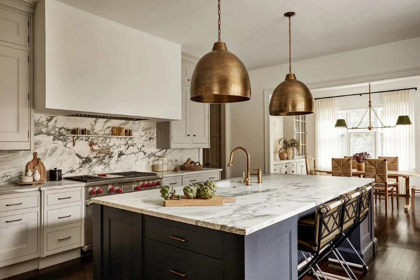
The 2000s and early 2010s favored crisp white and cool gray as homeowners embraced open, minimal spaces.
By the 2020s, that look began to feel sterile. Designers and homeowners started craving warmth, texture, and color again.
The return to natural tones and organic materials is not about nostalgia. It is about creating calm, collected interiors that feel lived-in rather than staged.
The 2026 Cabinet Palette: What’s Emerging
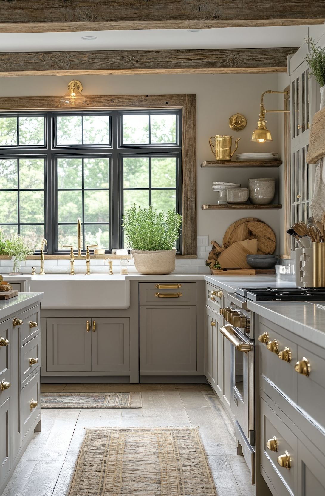
Greige cabinets with brass accents and marble counters create a neutral foundation that never goes out of style.
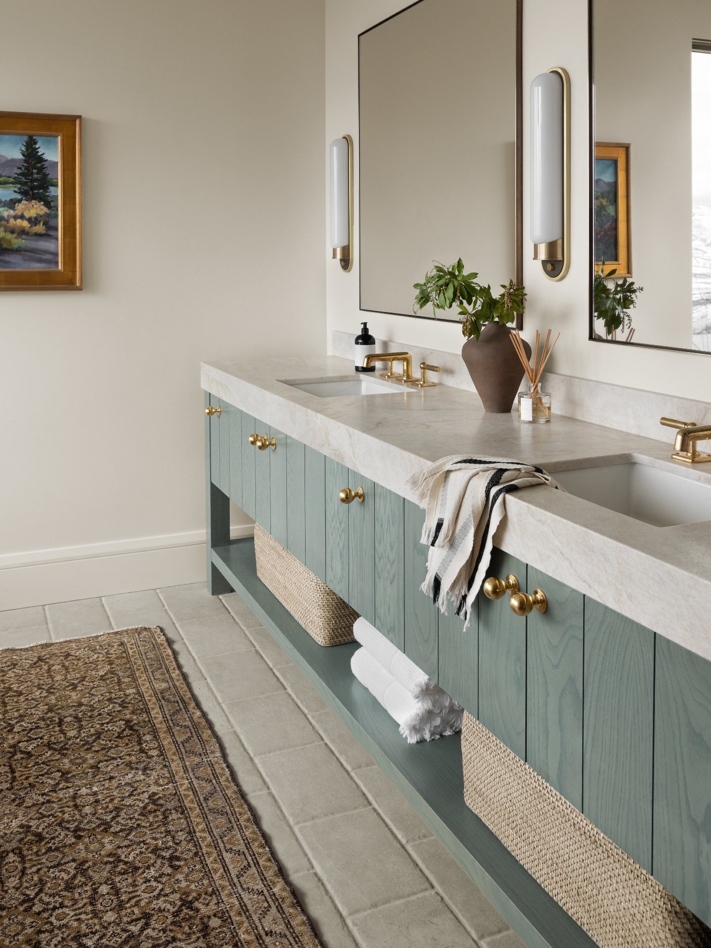
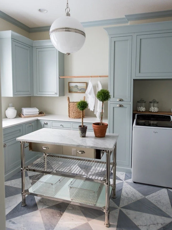
1. Moody Neutrals with Character
Neutrals are no longer safe and flat. They are layered, dimensional, and deeply comforting. Instead of gray or beige, today’s neutrals carry undertones of clay, mushroom, and soft green.
These tones work beautifully with natural textures such as white oak floors, brushed brass hardware, and stone counters.
Educational Tip: Undertones are subtle hints of color beneath a paint’s main hue. A greige with green undertones may appear warm under sunlight but slightly earthy under cool lighting. Always test swatches in both.
Ideal for: Homeowners seeking an elegant, timeless base that adapts with changing decor.

2. Nature-Inspired Greens
From the quiet olive kitchens of the 1930s to the botanical interiors of the midcentury era, green has always symbolized renewal. The modern versions, including olive, eucalyptus, and moss, connect indoor living with outdoor serenity.
These colors feel timeless because they draw directly from nature. They are especially fitting for homeowners who want their kitchens to feel both established and fresh.
Design Tip: Greens pair best with natural light and warm metals. For a lasting look, choose desaturated tones rather than vivid pigments.
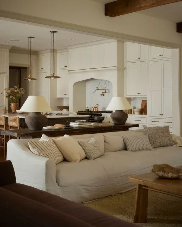
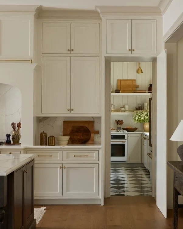
3. Warm Whites & Chalky Neutrals

Ivory cabinets and wood beams bring warmth and natural light into this elegant farmhouse kitchen.
White cabinetry has evolved from crisp and cool to creamy and lived-in. These tones recall European limewashed kitchens where surfaces softened naturally over time.
Modern warm whites are bright but never stark. They create soft transitions and pair well with natural woods or stone.
For Semi-Custom Lines: Satin and matte finishes help avoid glare and give the color a tactile, handcrafted quality.

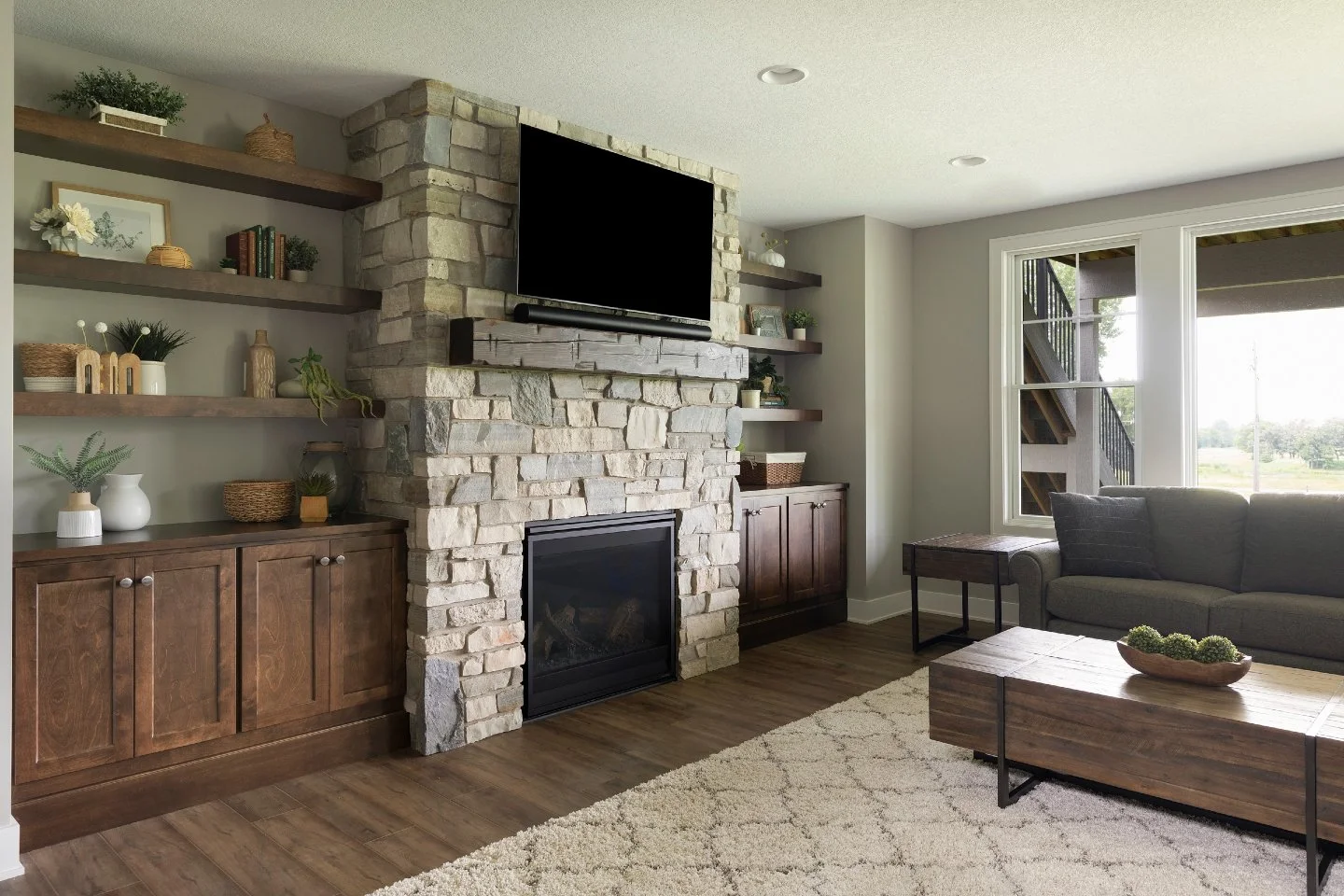
Rich walnut cabinetry with marble countertops blends craftsmanship and modern sophistication.
4. The Walnut & Brownwood Revival
Rich brown cabinetry has returned as a sign of craftsmanship and quiet luxury. The deep walnut tones of the 1980s are resurfacing, but with softer, natural finishes instead of glossy lacquer.
These wood tones bring balance and depth. They pair beautifully with light counters, creamy walls, and soft brass or matte black hardware.

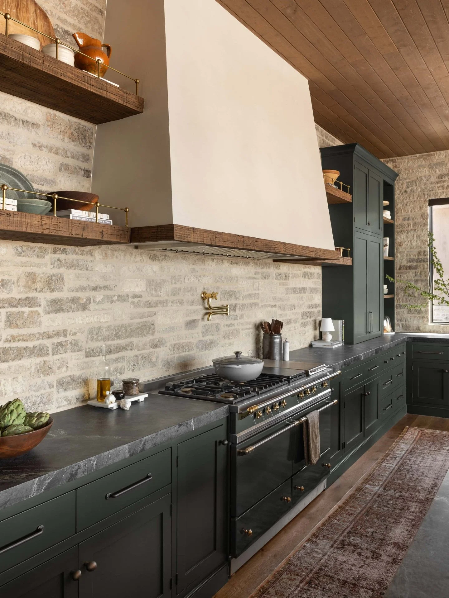
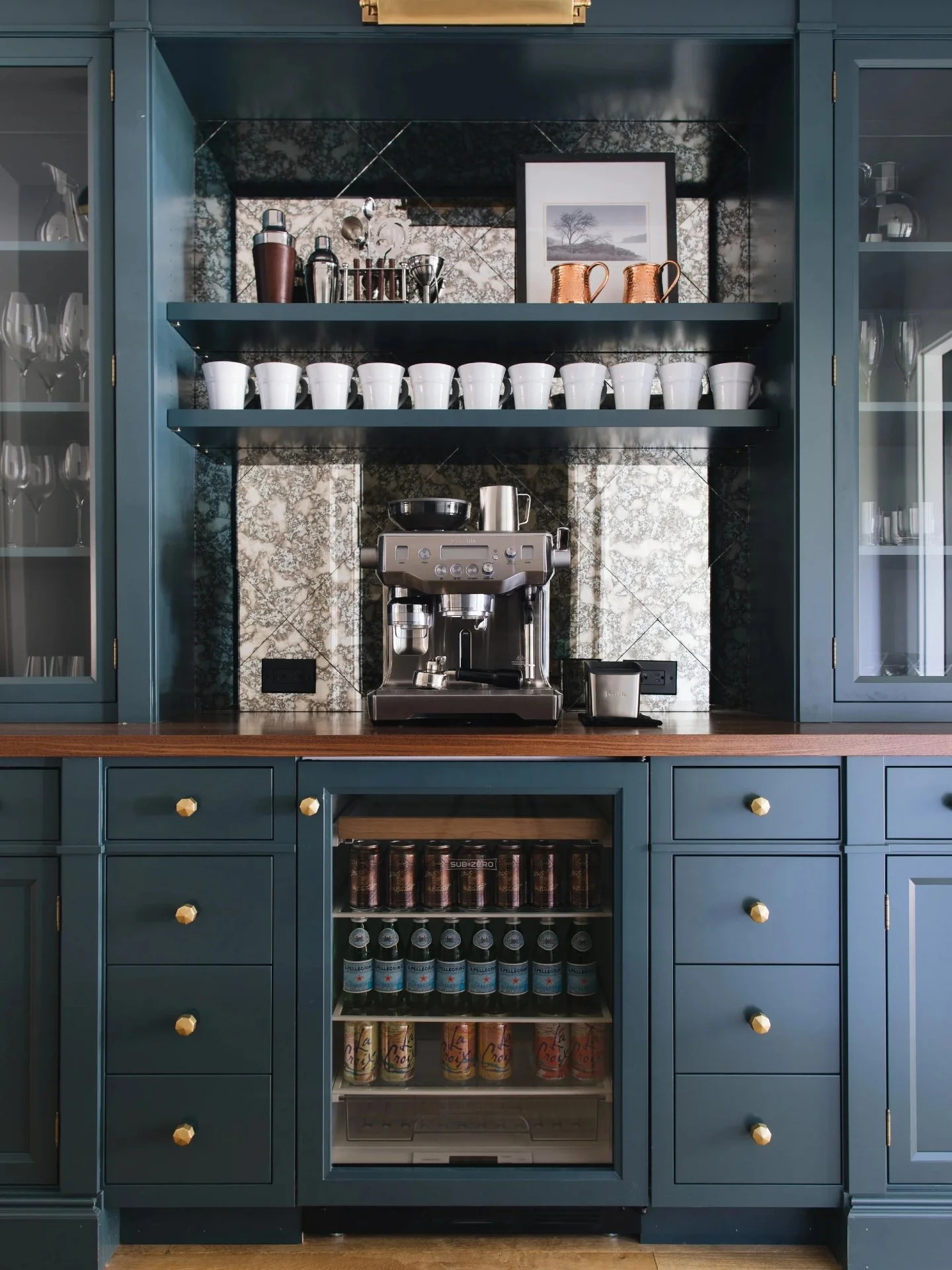
5. Soft Black & Charcoal Accents
Black cabinetry has found its balance again.
Matte charcoal tones highlight craftsmanship without overwhelming a room. They echo historical cabinetmaking, where deep stains revealed joinery and structure.
Design Tip: Use black thoughtfully, such as on an island, built-in, or vanity, to anchor the space and create contrast.
Pro Insight: Walnut naturally develops a patina over time, giving cabinetry character and heritage.
What’s Fading Gracefully
Cool Grays: Once sleek and modern, they now feel cold and impersonal.
High-Gloss Finishes: Show every fingerprint and feel dated next to matte textures.
Harsh Two-Tone Splits: White uppers with dark lowers are being replaced by tonal gradients and cohesive palettes.
How Color Aligns with Cabinet Type
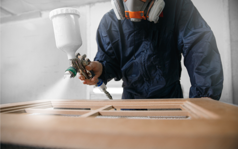
A craftsman applies a smooth, even finish to custom cabinetry, ensuring lasting color depth and durability in every Hester Family Millwork project.
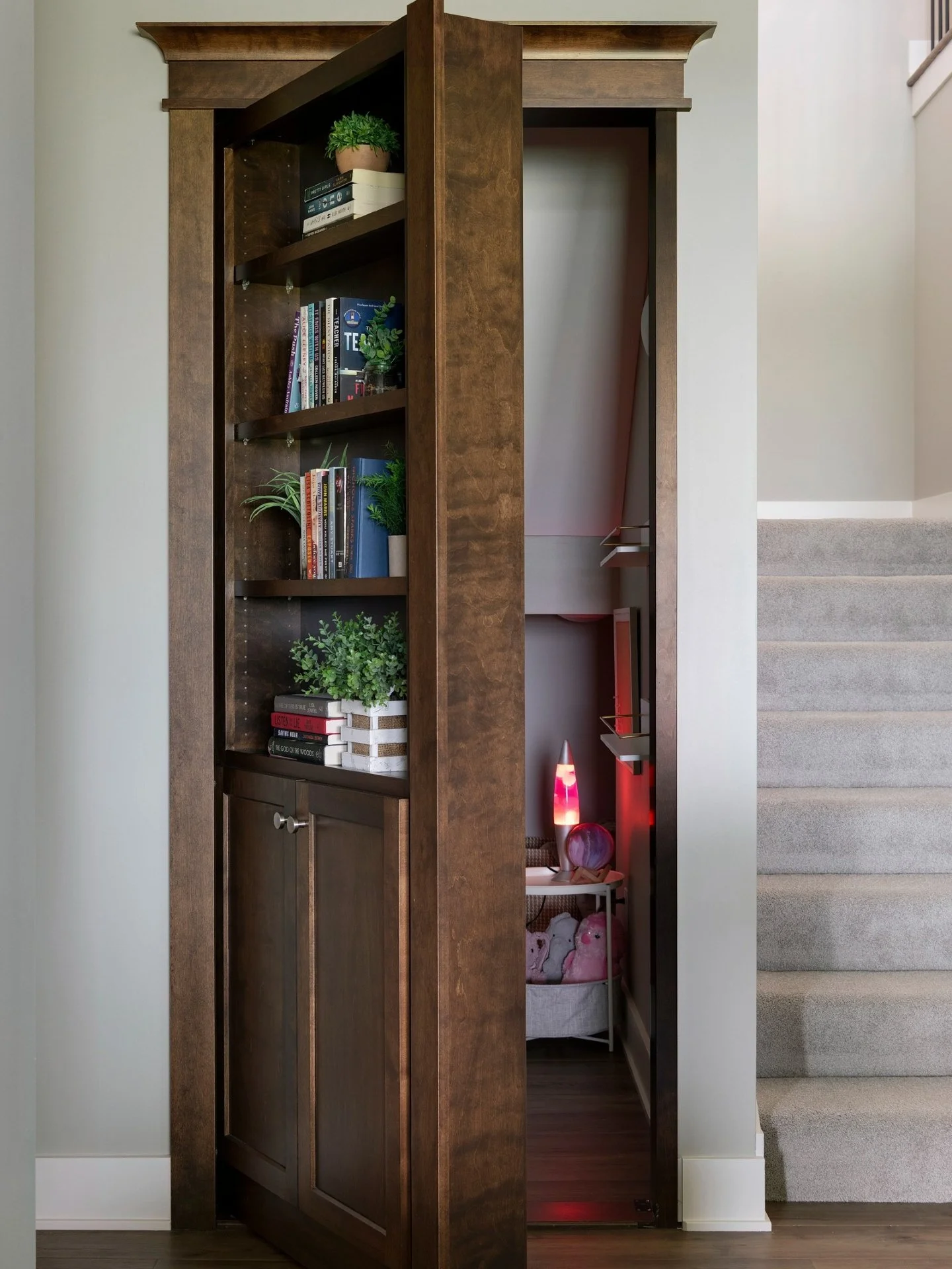
Custom Cabinetry
Custom options offer complete freedom to match tones, apply layered stains, and handcraft unique finishes. Perfect for homeowners who value longevity and individuality.
Semi-Custom Cabinetry
Semi-custom cabinetry balances flexibility and practicality. Many 2025 lines include warm neutrals and greens that emulate high-end design without full custom pricing.

Ready-to-Assemble (RTA) cabinetry arrives carefully packaged and ready for on-site assembly.
RTA Cabinetry
Ready-to-Assemble cabinetry has matured dramatically. Many collections now feature convincing wood textures and soft matte finishes that deliver style at an accessible price.
Educational Tip: RTA means the cabinets ship flat and are assembled on-site. This lowers shipping costs and gives homeowners more flexibility during installation.
The Data Behind Design Confidence
Nearly seventy percent of homeowners replace all their cabinetry during a kitchen remodel, confirming that color and finish drive design decisions.
White, wood tones, and soft neutrals remain the most popular cabinet colors, reflecting a move toward warmth and longevity.
Seventy-two percent of designers report growing demand for green and neutral cabinetry (Houzz 2025 Forecast).
Nearly sixty percent of new cabinetry lines now offer matte finishes as standard for both style and practicality.
These findings confirm what is visible across the industry. People are investing in warmth, realism, and long-term appeal rather than fleeting trends.
Looking Ahead to 2026 & Beyond

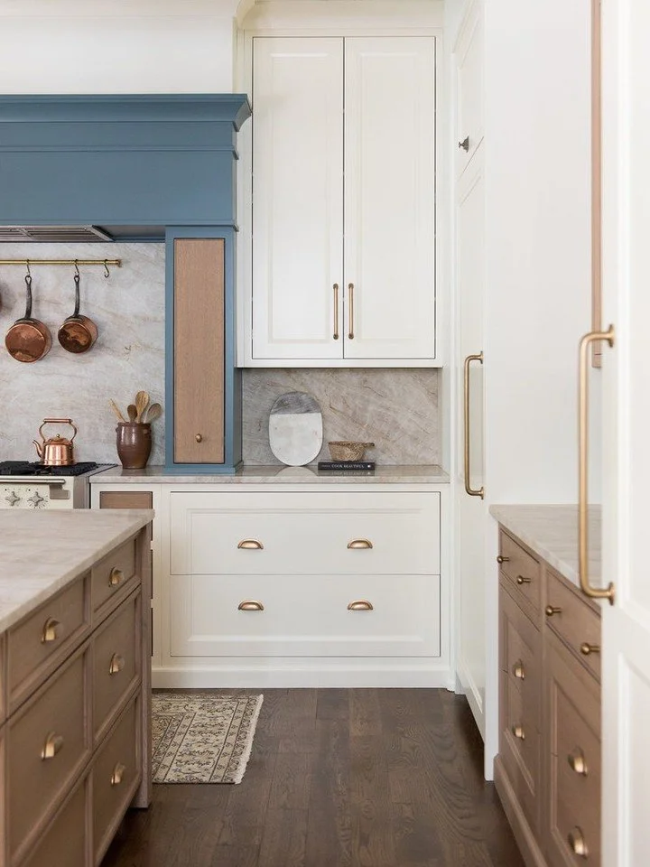
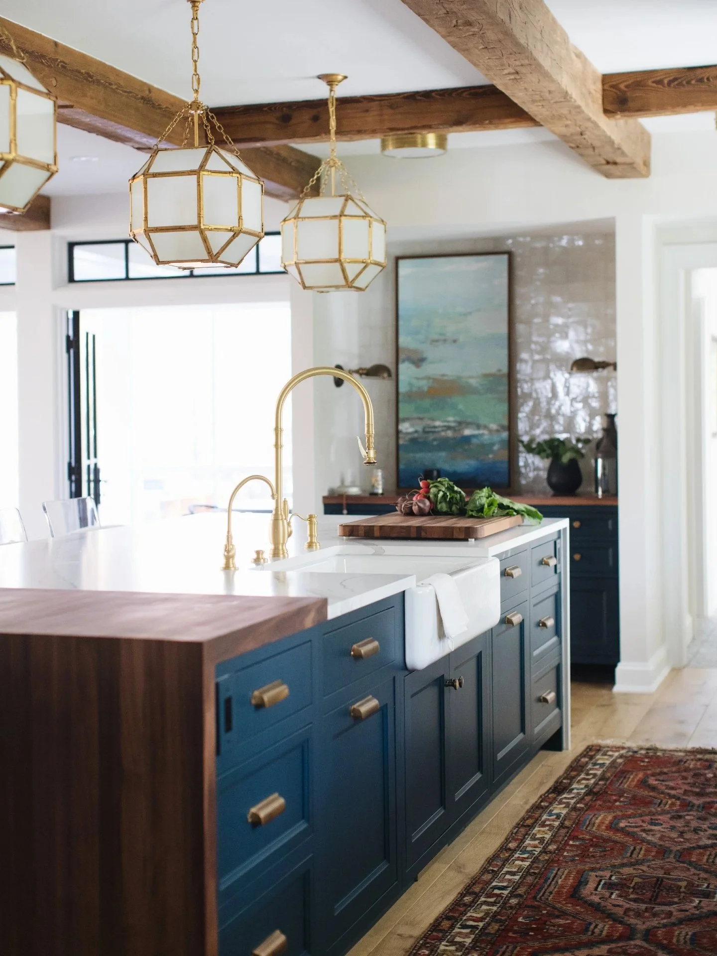
A timeless kitchen design blending soft white cabinetry with a navy island: showcasing the emerging 2026 trend toward layered neutrals and calming blue hues.
Expect to see muted blues, clay reds, and mineral tones drawn from natural materials. Future cabinetry palettes will focus on balance and authenticity.
The goal is not to make a statement that shouts, but to create spaces that whisper permanence, comfort, and beauty.
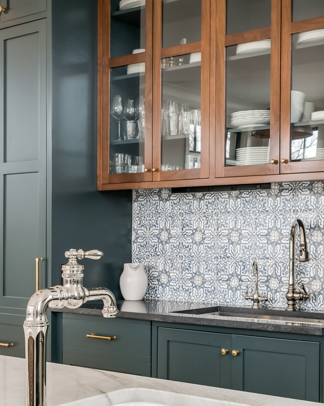
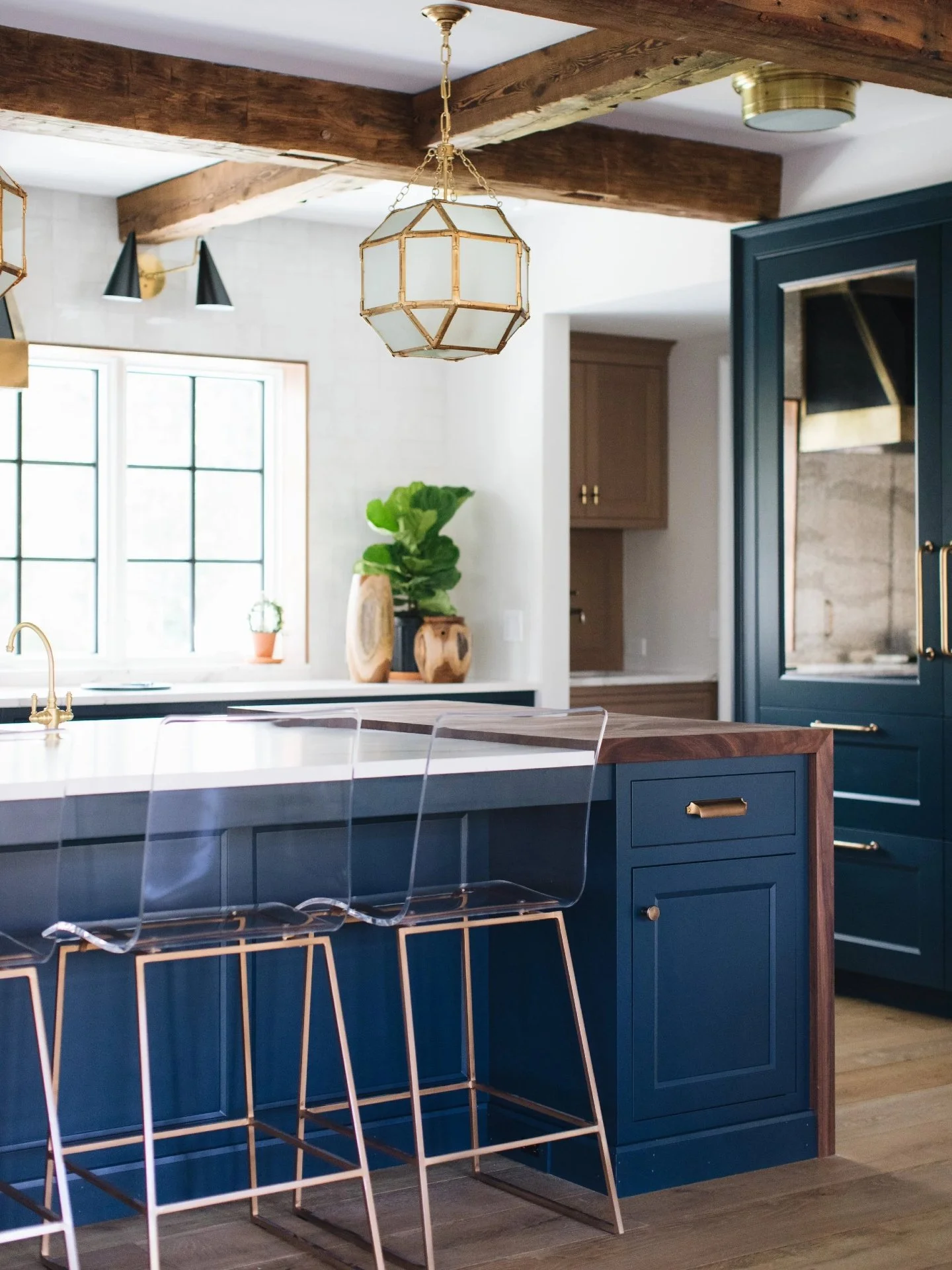
Deep teal cabinetry with warm wood framing and patterned backsplash; showcasing the next wave of design where cool and warm tones meet for timeless balance.
Final Thoughts
Cabinet color is not a small decision. It shapes how your home feels every single day.
The cabinetry colors gaining popularity in 2025 and 2026 are designed to last through trends and become part of your home’s story.
At Hester Family Millwork, every finish and tone is chosen with craftsmanship and care.
Whether you are planning custom, semi-custom, or RTA cabinetry, the goal is always the same.
Create a space that feels timeless, personal, and built to last.
TL;DR: The 2025–2026 Cabinet Color Forecast
Warm neutrals, earthy greens, and rich wood tones are redefining cabinetry in 2025–2026 as homeowners move away from cool grays toward finishes that feel natural, grounded, and lasting. Matte textures, soft whites, and organic palettes lead the trend, reflecting a shift toward calm, craftsmanship, and timeless design.
& bring the next chapter of cabinetry design into your home.